plotting
Utilities for making plots with your data.
BNF
<pisa-graph-configuration> ::= {
    "pisa": <pisa-section>,
    "coordinates": <coordinates-section>,
    "importance": <profile-section>,
    "predictions": <profile-section>,
    "annotations": <annotation-section>,
    "figure": {<figure-base>},
    <use-annotation-section>
    "min-value": <number>
}
<pisa-plot-configuration> ::= {
    "pisa": <pisa-section>,
    "coordinates": <coordinates-section>,
    "importance": <profile-section>,
    "predictions": <profile-section>,
    "annotations": <annotation-section>,
    "figure": <plot-figure-section>
}
<use-annotation-section> ::=
    <empty>
  | "use-annotation-colors": <boolean>,
<pisa-section> ::= {
    "h5-name": <string>,
  | "values": [<list-of-list-of-number>]
}
<list-of-list-of-number> ::=
    <list-of-number>, <list-of-number>
  | <list-of-number>
<coordinates-section> ::= {
    <sequence-source-section>
    "midpoint-offset": <integer>,
    "input-slice-width": <integer>,
    "output-slice-width": <integer>,
    "genome-window-start": <integer>,
    "genome-window-chrom": <integer>,
}
<sequence-source-section> ::=
    <empty>
  | "genome-fasta": <file-name>,
  | "sequence": <string>,
<profile-section> ::= {
    <profile-source>,
    <show-sequence-section>
    <profile-color-section>
}
<show-sequence-section> ::=
    <empty>
  | "show-sequence": <boolean>,
<profile-source> ::=
    "bigwig-name": <string>
  | "values": [<list-of-number>]
<profile-color-section> ::=
    <empty>
  | "color": <color-spec>
  | "color": <sequence-color-spec>
  | "color": [<list-of-sequence-color-spec>]
  | "color": [<list-of-color-spec>]
<annotation-section> ::= {
    <annotation-bed-section>
    <annotation-name-colors-section>
    <annotation-custom-section>
}
<annotation-bed-section> ::=
    <empty>
  | "bed-name": <file-name>,
<annotation-name-colors-section> ::=
    <empty>
  | "name-colors": {<dict-of-name-color>},
<annotation-custom-section> ::=
    <empty>
  | "custom": [<list-of-annotation>]
<dict-of-name-color> ::=
    <empty>
  | <name-color>
  | <name-color>, <dict-of-name-color>
<name-color> ::=
    <string>: <color-spec>
<list-of-annotation> ::=
    <empty>
  | <annotation>
  | <annotation>, <list-of-annotation>
<annotation> ::= {
    "start": <integer>,
    "end": <integer>,
    "name": <string>,
    "color": <color-spec>
}
<figure-base> ::=
    "bottom": <number>,
    "left": <number>,
    "width": <number>,
    "height": <number>,
    <annotation-height-section>
    <tick-font-size-section>
    <label-font-size-section>
    <miniature-section>
    "color-span": <number>,
<annotation-height-section> ::=
    <empty>
  | "annotation-height": <number>,
<tick-font-size-section> ::=
    <empty>
  | "tick-font-size": <integer>,
<label-font-size-section> ::=
    <empty>
  | "label-font-size": <integer>,
<plot-figure-section> ::= {
    <grid-mode-section>
    <diagonal-mode-section>
    <figure-base>
}
<grid-mode-section> ::=
    <empty>
  | "grid-mode": "on",
  | "grid-mode": "off",
<diagonal-mode-section> ::=
    <empty>
  | "diagonal-mode": "on"
  | "diagonal-mode": "off"
  | "diagonal-mode": "edge"
<miniature-section> ::=
    <empty>
  | "miniature": <boolean>
Parameter notes
pisa-section
You can specify either a file of PISA data or a custom array. If you give a file, you need to be very careful about coordinates! See the documentation for loadPisa for the coordinate convention used to make PISA plots.
h5-nameThe name of a PISA hdf5 file, generated by
interpretPisa. Cannot be used ifvaluesis present.valuesInstead of giving a PISA file, give an array of values to plot. These should already be sheared and in the form generated by
loadPisa. It will be an array of shape (num-regions, num-regions). Cannot be used ifh5-nameis given. Note that the cropping (incoordinates) is applied to this array, so it should represent the data for the whole window and then the plotting functions will crop in appropriately.
coordinates-section
genome-fastaThe name of a fasta-format file containing the genome of the organism. The relevant sequence information will be extracted based on
genome-window-startandgenome-window-chrom. Cannot be used ifsequenceis provided.sequenceInstead of looking up the sequence in a fasta, you can provide it manually. This should be a string of
A,C,G, andT, and it must have the same length as the shape of the values array (or, equivalently, the number of regions in your PISA hdf5 file). Default: If no sequence is provided, then you cannot useshow-sequencein the importance or prediction sections.midpoint-offsetFor making a plot, how far from the left edge of the PISA data do you want the middle of the plot to be? For example, if your PISA data start at coordinate 131,500 and you want coordinate 132,000 to be in the middle of the plot, you’d set
"midpoint-offset": 500.input-slice-width,output-slice-widthHow wide of a region do you want to be plotted?
input-slice-widthdetermines the width of the x-axis. Use a smaller value to see the effect of fewer and fewer bases.output-slice-widthdetermines the height of the y-axis. Use smaller values to zoom in on local effects. For PISA graphs, these parameters have a slightly different meaning.input-slice-widthdetermines how wide of a window you want plotted. Both the top and bottom of the graph will be this wide.output-slice-widthdetermines how much you want to allow for lines that go past the end of the figure. Ifoutput-slice-width > input-slice-widththen any lines that would go from an input on the page to an output off the page (or vice-versa) will still be drawn, they’ll just stop when they get to the edge of the plot. I recommend keepingoutput-slice-widthabout 200 or so larger thaninput-slice-widthfor PISA graphs.genome-window-start,genome-window-chromThese are used to set the values for the tick labels on the plots, and also to extract the sequence from a fasta file if you provided
genome-fasta.
profile-section
The profile section gives the data that should be plotted in the importance score or prediction tracks. The format for both tracks is identical.
bigwig-nameThe name of the bigwig file to read from. Data will be extracted based on
genome-window-startandgenome-window-chrom. Cannot be used withvalues.valuesAn array of shape (num-regions) containing the profile values to use at each base, starting at
genome-window-start.show-sequenceIf
true, then draw the actual letters of the DNA sequence to represent the profile. Iffalse, then draw a bar plot like in IGV. Default:false.colorColor, for a profile, can be one of several things. It can be a single
color-spec, or a dictionary with onecolor-specfor each DNA base. Alternatively, it can be a list ofcolor-spec(or dictionary with onecolor-specfor each base) with one entry for each position in the profile. This way, you can color each bar (or each letter in the logo) a different color. See thecolorsdocumentation for a description ofcolor-spec. Default: Ifshow-sequenceistrue, then the default Wong color map for bases. Ifshow-sequenceisfalse, then Tol color 0.
annotation-section
Annotations are used to label specific areas of the plot, typically with things like motifs and genes.
bed-nameIf you scanned for motifs, then you can give a bed file here. Hits in that bed file will be drawn on the plot. Default: Do not read in a bed file.
name-colorsIn order to provide a consistent color to each named motif, you can specify which names get which colors. It is a simple dict mapping names (e.g., “Abf1”) to colorSpecs. Whenever an entry from the bed file is drawn, the code will check to see if that entry’s name appears in this dict. If it does, then that color will be used to draw its annotation box. Default: Assign colors as names are encountered.
customA list of annotations that you provide that do not come from the bed file. An annotation is a simple dict mapping
startandendto (genomic) coordinates, along with anamegiving the text to draw and acolorgiving a colorSpec to use. Seecolorsfor colorSpec documentation. Default: No custom annotations.
figure-section
bottom,left,width,heightWhere on the given figure should the plot be placed? Note that axis labels and other text can overflow this bounding box. For figure prep, you’ll likely have to tweak these parameters.
annotation-heightHow tall, as a fraction of the total height allocated for annotations, should the drawn boxes be? Note that some extra space will be placed between the boxes for clarity. For large figures, you’ll probably want to make this smaller. Default: 0.13
tick-font-size,label-font-sizeFor coordinate ticks and text labels, what font size should be used? Defaults:
tick-font-sizedefaults to 6 andlabel-font-sizedefaults to 8.color-spanThis sets the color limit for PISA values. If a clipping color map is used, then any values above this will show as clipped colors.
miniatureAlters the layout of the graph to be a better fit to single-column display. Default:
false.grid-mode,diagonal-modeFor PISA plots only (not PISA graphs), these parameters determine whether or not the grid lines and diagonal line should be drawn.
grid-modecan be either"on"or"off", whilediagonal-modecan be one of"on","off", or"edge".edgemeans that the diagonal lines should only be drawn at the border of the PISA plot, like inward-facing axis ticks. Defaults:grid-modedefaults to"on"anddiagonal-modedefaults to"edge".line-widthFor PISA graphs only (not plots). This sets the width of the lines that connect the cause to effect. For large images, increasing this reduces Moiré interference. Default: 1.0
Specific parameters
min-valueOnly applicable to PISA graphs, not plots. If (the absolute value of) a PISA entry between two bases is less than min-value, no line will be drawn at all. I recommend keeping this at about the 95th percentile of your PISA data, as otherwise an absolutely enormous number of splines will be drawn.
use-annotation-colorsOnly applicable to PISA graphs. If
true, then any splines that originate from a base that overlaps with an annotation will be drawn in the color of that annotation instead of the normal color map. This is useful for showing the effects of different motifs, for example. Iffalse, then all splines will use the default color map based on the PISA value between the bases they connect. Default:false.
Module contents
- bpreveal.plotting.plotPisaGraph(config, fig, validate=True)
Make a graph-style PISA plot.
- Parameters:
config (dict) – The JSON (or any dictionary, really) configuration for this PISA plot.
fig (Figure) – The matplotlib figure that will be drawn on.
validate (bool) – Should the configuration be checked? If you’re passing in numpy arrays, the json validator is prone to exploding.
- Returns:
A dictionary containing the created Axes objects, the assigned colors for annotations, and the genomic coordinates is the plot.
The structure of the returned dict is:
{"axes": {"pisa": matplotlib.axes,
          "importance": matplotlib.axes,
          "predictions": matplotlib.axes,
          "annotations": matplotlib.axes,
          "cbar": matplotlib.axes}
    "name-colors": Same structure as the config dict, but with missing entries added.
    "genome-start": int,
    "genome-end": int,
    "config": config dict with data loaded.}
Example:
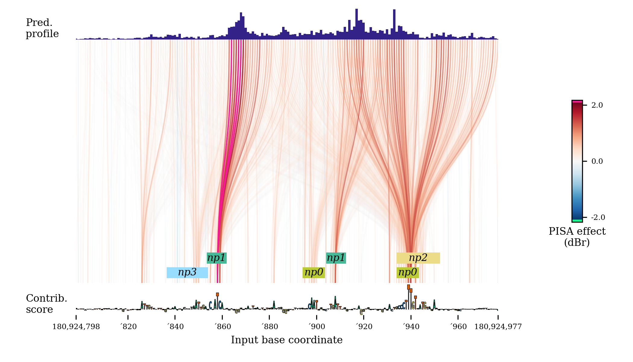
fig = plt.figure(figsize=(7,4))
pisaSection = {"h5-name": f"{WORK_DIR}/shap/pisa_nanog_positive.h5"}

coordinatesSection = {
    "genome-fasta": GENOME_FASTA,
    "midpoint-offset": 1150,
    "input-slice-width": 200,
    "output-slice-width": 500,
    "genome-window-start": windowStart,
    "genome-window-chrom": windowChrom
}

predictionSection = {"bigwig-name": f"{WORK_DIR}/pred/nanog_residual_positive.bw"}

importanceSection = {
    "bigwig-name": f"{WORK_DIR}/shap/nanog_profile.bw",
    "show-sequence": True
}

annotationSection = {"bed-name": f"{WORK_DIR}/scan/nanog_profile.bed"}

figureSectionGraph = {
    "left": 0.12,
    "bottom": 0.13,
    "width": 0.8,
    "height": 0.85,
    "color-span": 0.5,
}

graphConfig = {
    "pisa": pisaSection,
    "coordinates": coordinatesSection,
    "importance": importanceSection,
    "predictions": predictionSection,
    "annotations": annotationSection,
    "figure": figureSectionGraph,
    "min-value": 0.1,
    "use-annotation-colors": False
}

bpreveal.plotting.plotPisaGraph(graphConfig, fig);
This code produces a graph that looks like this:
By turning
miniaturetotrue, and setting the figure size to (3, 2), you instead get a plot like this: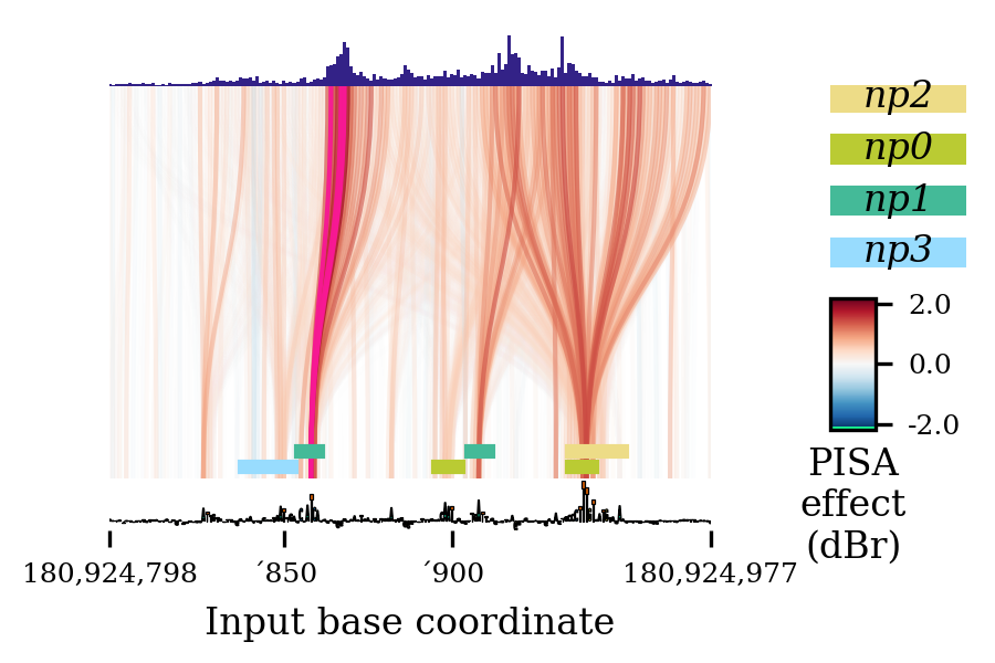
(Actually, this particular graph had overlapping labels that I had to remove with
deleteTick().)
- bpreveal.plotting.plotPisa(config, fig, validate=True)
Given the actual vectors to show, make a pretty PISA plot.
- Parameters:
config (dict) – The JSON (or any dictionary, really) configuration for this PISA plot.
fig (Figure) – The matplotlib figure that will be drawn on.
validate (bool) – Should the configuration be checked? If you’re passing in numpy arrays, the json validator is prone to exploding.
- Returns:
A dict containing the generated axes, along with the assigned name colors and the coordinates that were plotted.
The returned dict will have the following structure:
{"axes": {"pisa": matplotlib.axes,
          "importance": matplotlib.axes,
          "predictions": matplotlib.axes,
          "annotations": matplotlib.axes,
          "cbar": matplotlib.axes}
    "name-colors": Same structure as the config dict, but with missing entries added.
    "genome-start": int,
    "genome-end": int,
    "config": config dict with data loaded}
Example:
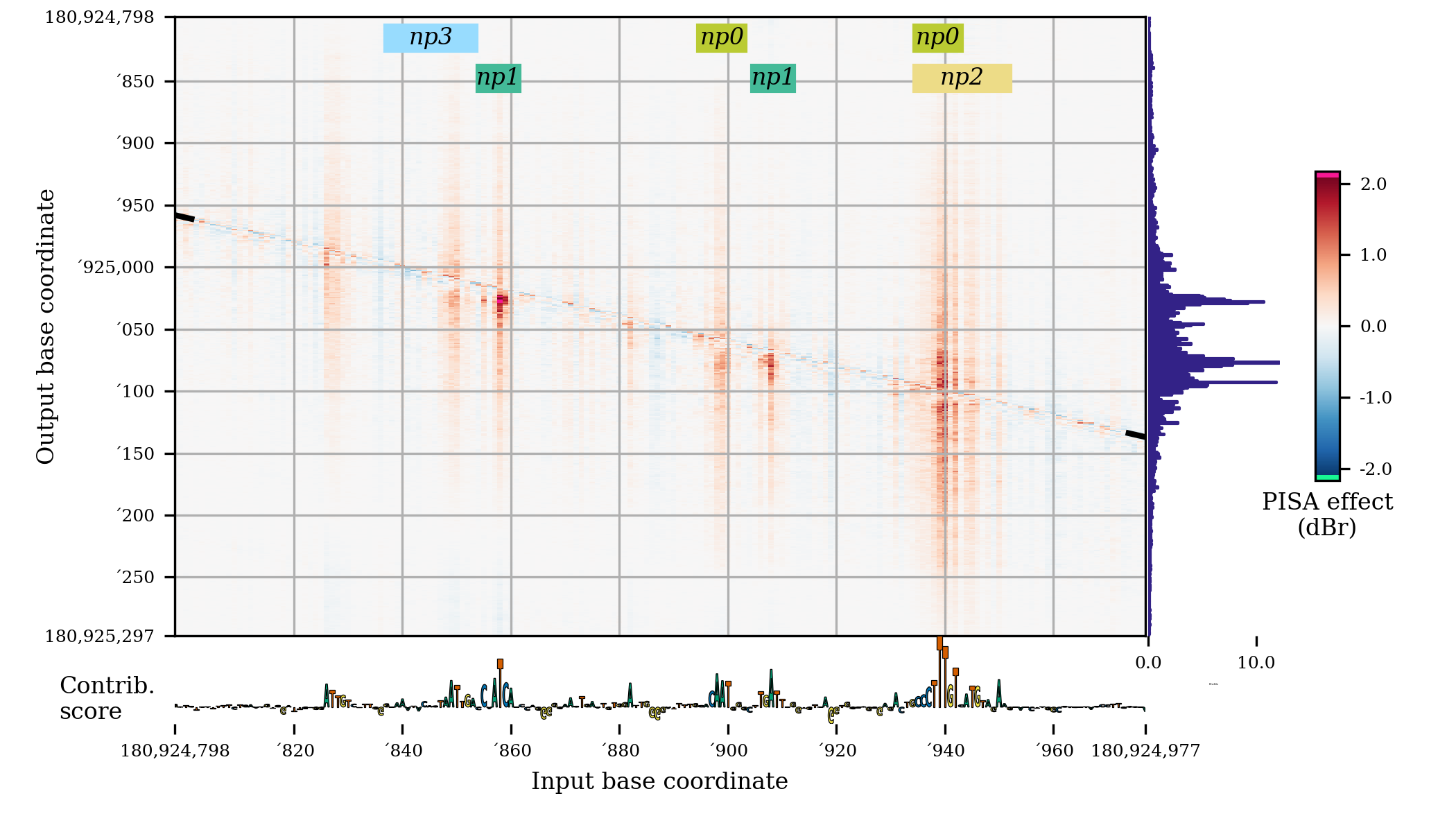
fig = plt.figure(figsize=(7,4))

pisaSection = {"h5-name": f"{WORK_DIR}/shap/pisa_nanog_positive.h5"}

coordinatesSection = {
    "genome-fasta": GENOME_FASTA,
    "midpoint-offset": 1150,
    "input-slice-width": 200,
    "output-slice-width": 500,
    "genome-window-start": windowStart,
    "genome-window-chrom": windowChrom
}

predictionSection = {"bigwig-name": f"{WORK_DIR}/pred/nanog_residual_positive.bw"}

importanceSection = {
    "bigwig-name": f"{WORK_DIR}/shap/nanog_profile.bw",
    "show-sequence": True
}

annotationSection = {"bed-name": f"{WORK_DIR}/scan/nanog_profile.bed"}

figureSectionPlot = {
    "left": 0.12,
    "bottom": 0.13,
    "width": 0.8,
    "height": 0.85,
    "color-span" : 0.5,
}

plotConfig = {
    "pisa": pisaSection,
    "coordinates": coordinatesSection,
    "importance": importanceSection,
    "predictions": predictionSection,
    "annotations": annotationSection,
    "figure": figureSectionPlot
}

bpreveal.plotting.plotPisa(plotConfig, fig)
This code produces a plot that looks like this:
By turning
miniaturetotrue, and setting the figure size to (3, 2), you instead get a plot like this: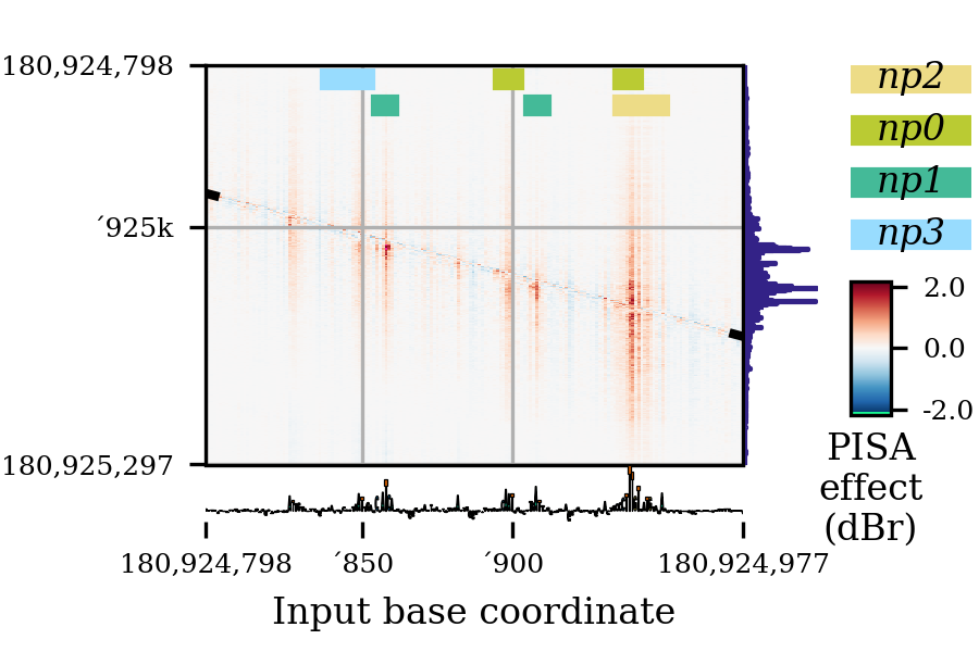
(Actually, this particular plot had overlapping labels that I had to remove with
deleteTick().)
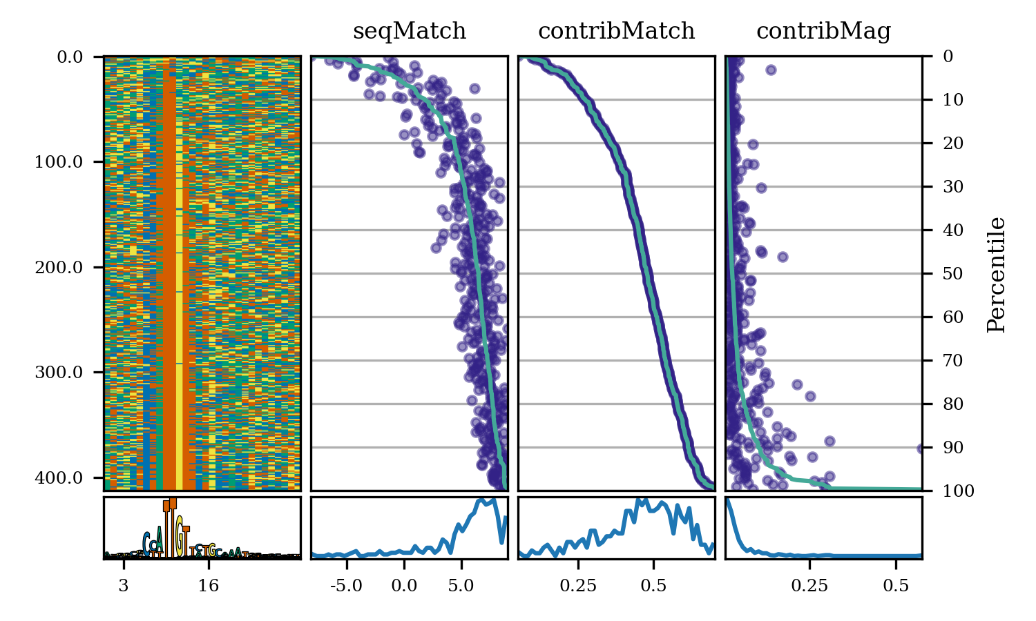
- bpreveal.plotting.plotModiscoPattern(pattern, fig, sortKey=None)
Create a plot showing a pattern’s seqlets and their match scores.
- Parameters:
sortKey (None or ndarray) – Either None (do not sort) or an array of shape (numSeqlets,) giving the order in which the seqlets should be displayed. See example below for common use cases.
pattern (Pattern) – The pattern to plot. This pattern must have already had its seqlets loaded.
fig (Figure) – The matplotlib figure upon which the plots should be drawn.
Example:
# Background ACGT frequency
bgProbs = [0.291, 0.208, 0.208, 0.291]
patSox2 = motifUtils.Pattern("pos_patterns", "pattern_0", "Sox2")
with h5py.File(f"{WORK_DIR}/modisco/sox2_profile/modisco.h5", "r") as fp:
    patSox2.loadCwm(fp, 0.3, 0.3, bgProbs)
    patSox2.loadSeqlets(fp)
fig = plt.figure(figsize=(5, 5))
# Sort the seqlets by their contribution match.
sortKey = [x.contribMatch for x in patSox2.seqlets]
plotModiscoPattern(patSox2, fig, sortKey=sortKey)
This produces the following plot:
- bpreveal.plotting.plotSequenceHeatmap(hmap, ax, upsamplingFactor=10)
Show a sequence heatmap from an array of one-hot encoded sequences.
- Parameters:
hmap (ndarray[Any, dtype[uint8]]) – An array of sequences of shape (numSequences, length, 4)
ax (Axes) – A matplotlib Axes object upon which the heatmap will be drawn.
upsamplingFactor (int) – How much should the x-axis be sharpened? If upsamplingFactor * hmap.shape[1] >> ax.width_in_pixels then you may get aliasing artifacts. If upsamplingFactor * hmap.shape[1] << ax.width_in_pixels then you will get blurry borders.
- bpreveal.plotting.plotLogo(values, width, ax, colors, spaceBetweenLetters=0)
Plot an array of sequence data (like a pwm).
- Parameters:
values (ndarray[Any, dtype[float32]]) – An (N,4) array of sequence data. This could be, for example, a pwm or a one-hot encoded sequence.
width (float) – The width of the total logo, useful for aligning axis labels.
ax (Axes) – A matplotlib axes object on which the logo will be drawn.
colors (
DNA_COLOR_SPEC_T| list[DNA_COLOR_SPEC_T]) – The colors to use for shading the sequence. See below for details.spaceBetweenLetters (float) – How much should the letters be squished? This is given as a fraction of the total letter width. For example, to have a gap of 2 pixels between letters that are 10 pixels wide, set
spaceBetweenLetters=0.2.
- Return type:
None
- Colors, if provided, can have several meanings:
- Give a color for each base type by RGB value.
In this case, colors will be a dict of tuples:
{"A": (.8, .3, .2), "C": (.5, .3, .9), "G": (1., .4, .0), "T": (1., .7, 0.)}This will make each instance of a particular base have the same color.
- Give a color for each base by color-spec.
This would be something like:
{"A": {"wong": 3}, "C": {"wong": 5}, "G": {"wong": 4}, "T": {"wong": 6}}You can get the default BPReveal color map atcolors.dnaWong.
- Give a list of colors for each base.
This will be a list of length
values.shape[0]and each entry should be a dictionary in either format 1 or 2 above. This gives each base its own color palette, useful for shading bases by some profile.
- bpreveal.plotting.getCoordinateTicks(start, end, numTicks, zeroOrigin)
Given a start and end coordinate, return x-ticks that should be used for plotting.
- Parameters:
start (int) – The genomic coordinate where your ticks start, inclusive.
end (int) – The genomic coordinate where your ticks end, inclusive.
numTicks (int) – The approximate number of ticks you want.
zeroOrigin (bool) – The actual x coordinate of the ticks should start at zero, even though the labels start at
start. Otherwise, the ticks will be positioned at coordinatestarttoend, and so your axes limits should actually correspond to genomic coordinates.
- Returns:
Two lists. The first is the x-coordinate of the ticks, and the second is the string labels that should be used at each tick.
- Return type:
tuple[list[float], list[str]]
Given a start and end coordinate, return a list of ticks and tick labels that 1. include exactly the start and stop coordinates 2. Contain approximately numTicks positions and labels. 3. Try to fall on easy multiples 1, 2, and 5 times powers of ten. 4. Are formatted to reduce redundant label noise by omitting repeated initial digits.
- bpreveal.plotting.deleteTick(ax, which, index)
Delete a particular offending tick from an Axes.
- Parameters:
ax (Axes) – The axes that has the offending tick.
which (Literal['x'] | ~typing.Literal['y'] | ~typing.Literal['both']) – Either
"x","y", or"both", indicating which axis has the problem.index (int) – Which tick label index is the problem? This is a list index, and a negative number removes a particular label starting from the right. (Just like normal list indexing in Python.)
This function helps when you have overlapping ticks, which happens annoyingly often since genomic coordinates tend to be huge numbers.
Consider the following PISA plot:
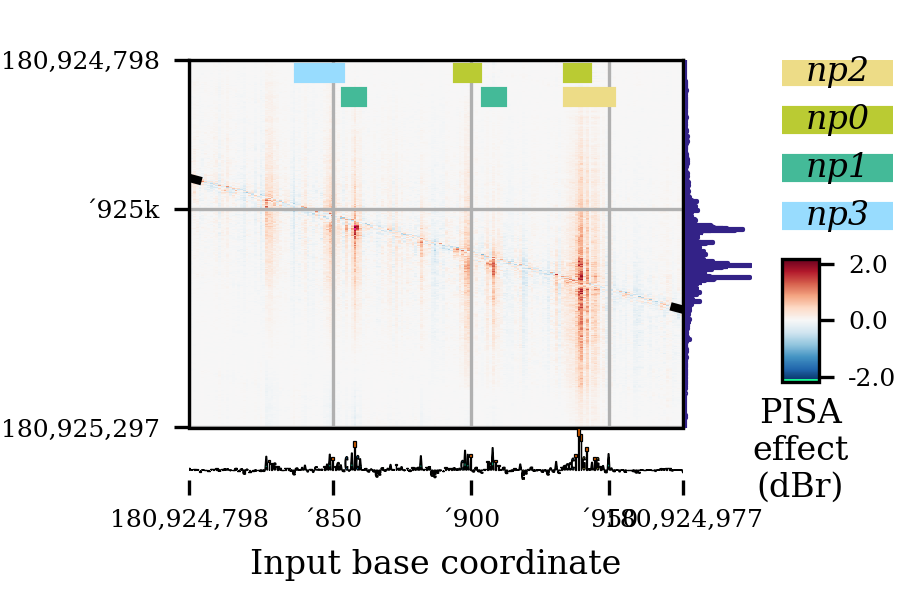
As you can see, the label for
'950is overlapping with the right-end label for180924977. To delete this offending tick, I can use this function, like this:r = bprplots.plotPisa(plotConfig, fig) bprplots.deleteTick(r["axes"]["importance"], "x", -2) bprplots.deleteTick(r["axes"]["pisa"], "x", -2)
Note that I had to remove the tick from both the importance and pisa axes. The deletion on the pisa axes causes the grid line to disappear.
The result of this correction is the following:
- bpreveal.plotting.plotPisaWithFiles(pisaDats, cutMiddle, cutLengthX, cutLengthY, receptiveField, genomeWindowStart, genomeWindowChrom, genomeFastaFname, importanceBwFname, motifScanBedFname, profileDats, nameColors, fig, bbox, colorSpan=1.0, boxHeight=0.1, fontsize=5, mini=False)
Deprecated way to get the new config dict. Issues a warning if used.
- Parameters:
pisaDats (str)
cutMiddle (int)
cutLengthX (int)
cutLengthY (int)
receptiveField (int)
genomeWindowStart (int)
genomeWindowChrom (str)
genomeFastaFname (str)
importanceBwFname (str)
motifScanBedFname (str)
profileDats (str)
nameColors (dict[str, tuple[float, float, float]])
fig (Figure)
bbox (tuple[float, float, float, float])
colorSpan (float)
boxHeight (float)
fontsize (int)
mini (bool)